Role
Product Designer
Team
Innovative Design Co. - Agency
Karl - Swam Tech Team Leader
Hannah - Product Designer
Website
Currently in development stage
Project Type
Website Redesign
Duration
July 2021 - August 2021 (6 Weeks)
Tools Used
Figma, Photoshop, Procreate
The Problem 🧰
Swam Tech is a start-up unable to develop a strong appealing website for investors
The Solution 🧩
Redesigning the Swam Tech Company’s website to attract venture capitalists!
BACKGROUND 🗒
Applying my design skills to start-ups with Innovative Design Co. to learn, grow, and create
Through Innovative Design Co., a student-run organization & pro-bono agency looking to aid start-ups who seek student talent for UX Design & consulting, I was able to put my design skills to the test with Swam.Tech
Currently looking to showcase their product to users, venture capitalists, and students, the Swam team proposed a redesign of their website pages to Innovative Design Co. to effectively promote the Swam Tech brand

The Design Challenge
The existing website pages were not effectively portraying product value, failed at securing user attention, and required optimized for potential venture capitalists.
DISCOVERY ☀️
Must identify the the problem by evaluating the existing website design
To identify the current website flaws, Hannah and I focused on evaluating the design of the existing Swam Tech website pages. Taking a closer look at the visual layout, investors considerations, visual hierarchy and more, we were able to get a better idea of where we could make improvements. While doing so, we took some quick notes with ideas, thoughts, and action items to look back on during the ideation phase.
Evaluating Existing Website Designs ✏️
First Impressions 👉
📌No product
📌More white space
📌Clear call to action
Overall Design 👉
📌Lack of white space
📌Lacking visual hierarchy
Inconsistency 👉
📌Inconsistent fonts
📌Lack of distinct branding
👈 Display Product
📌Include the product display and description
📌Low contrast text
👈 Busy Page
📌Large bodies of text
📌Unsuitable text alignment
SKETCHES ✍️
Sketching ideas to explore new layouts, hierarchies, and designs
Using Procreate, I began sketching my ideas onto a fresh artboard, focusing on each page separately. I wanted to visualize different layout options and figure out what order of sections would feel the most natural.
Hannah and myself played around with various ways to add content from other pages and replace them onto existing pages.
STYLE GUIDE
Visual Design 🎨
A style guide helps to ensure a continuous brand experience.
Using Procreate, I was able to create clean, minimal, and abstract shapes for Swam. This added subtle visual components and matched the existing brand theme.
WIREFRAMES 🔌
Creating definite sections, adding new content, and iterating further
Upon approval from Swam of our preliminary sketches, our team moved forward with low fidelity wireframes. At this point, we were considering additional content that must be added, the order of sections displayed, and overall visual design. Hannah and myself often found ourselves jumping between brainstorming content and designing to accurately visualize our ideas.
It was in during this time that we also introduced sections to the page that weren't in the original design:
tap to take a peep at the final design…
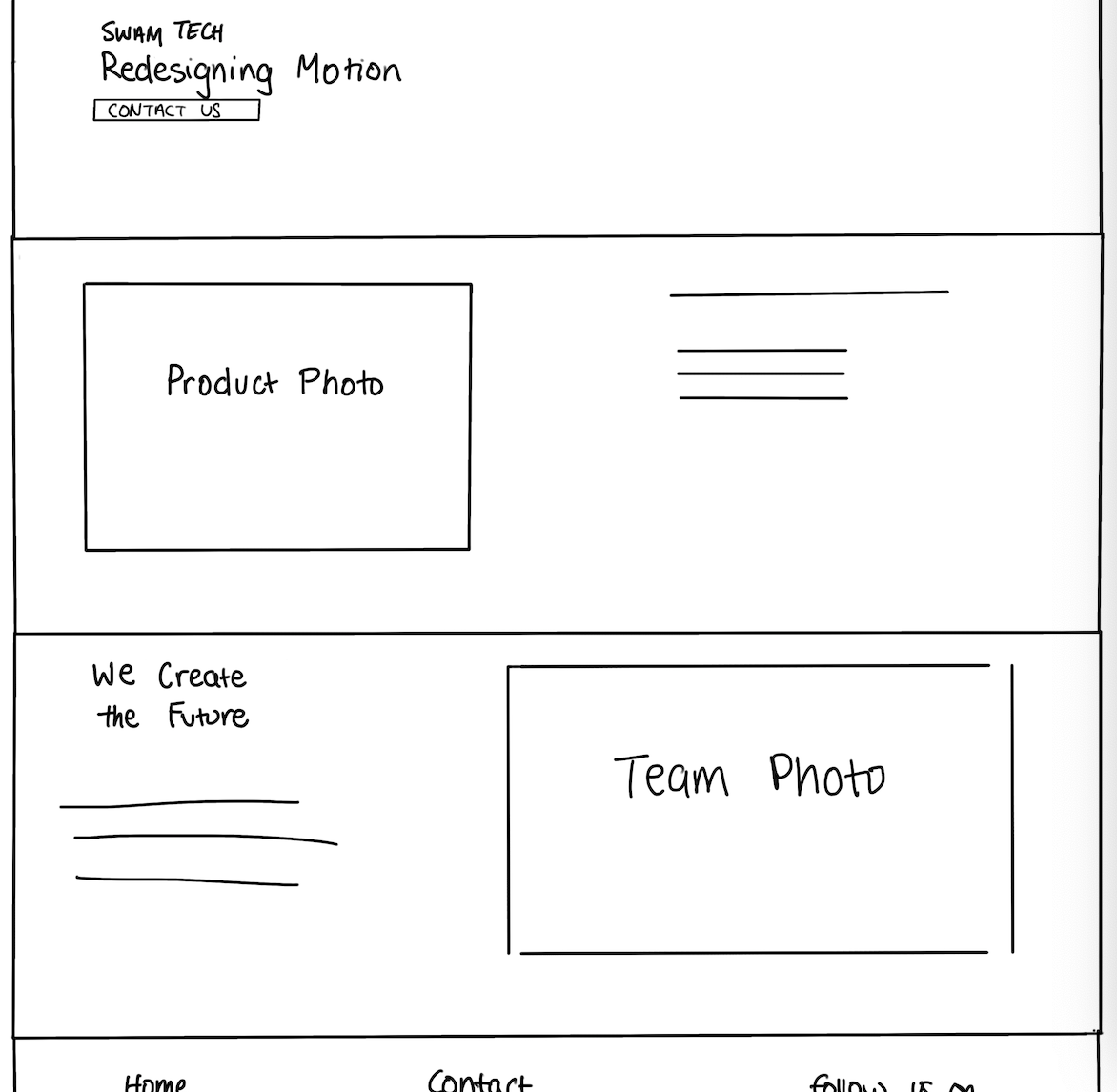
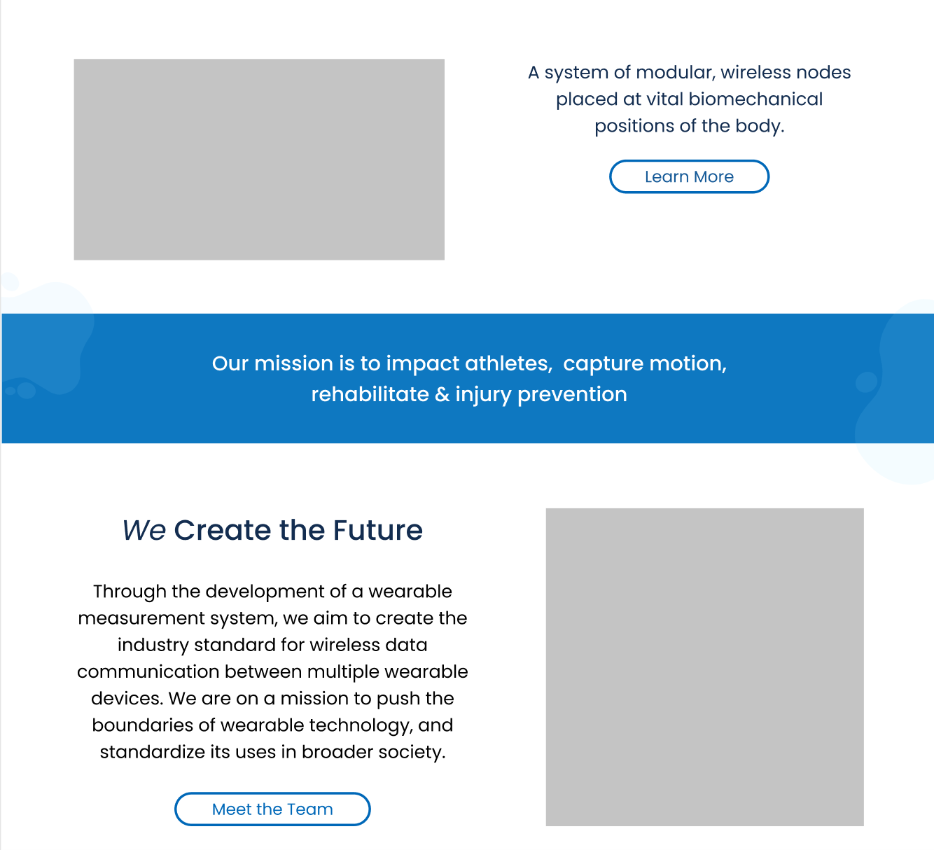
Creating a mission statement to showcase an ideal vision for the company's future, directing its growth.
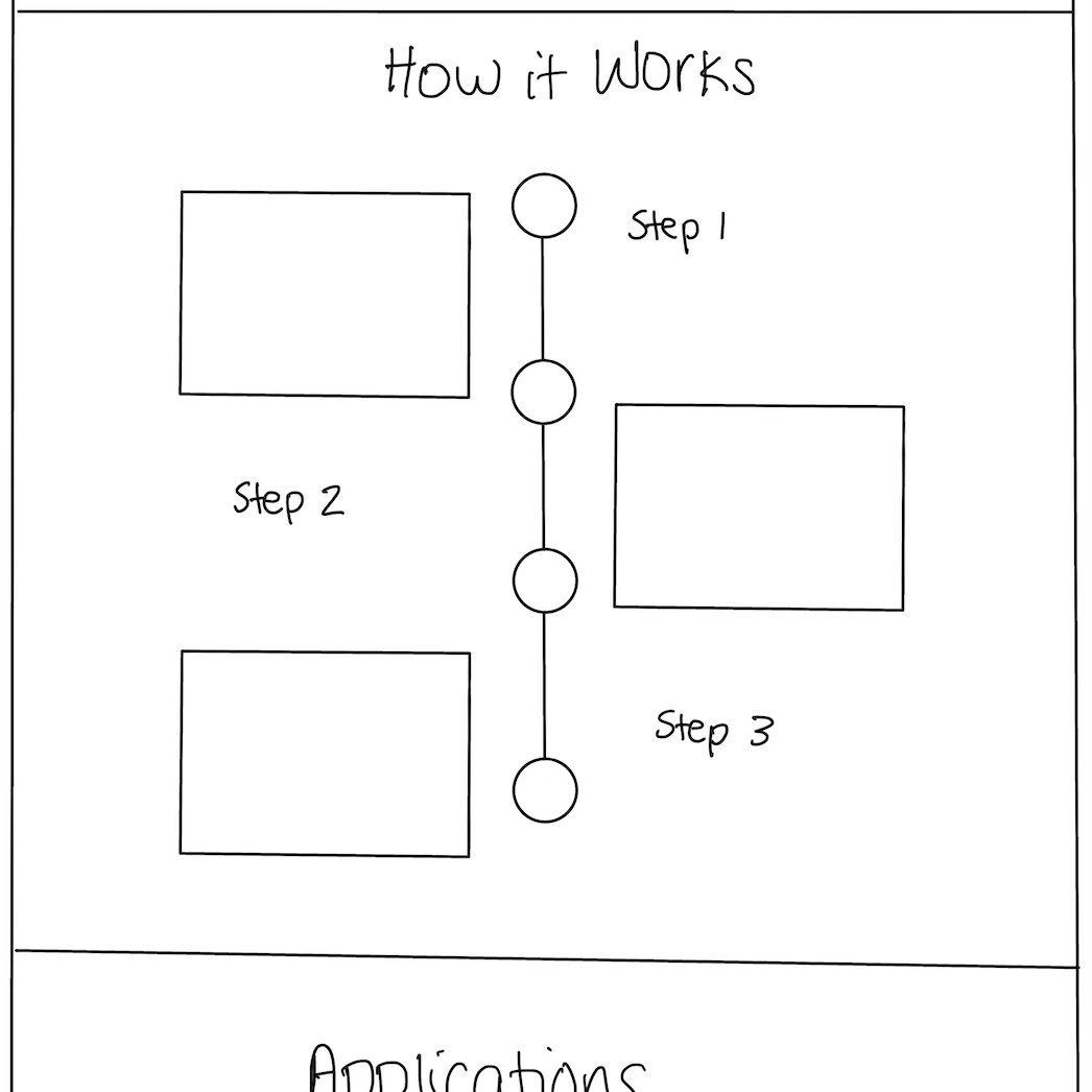
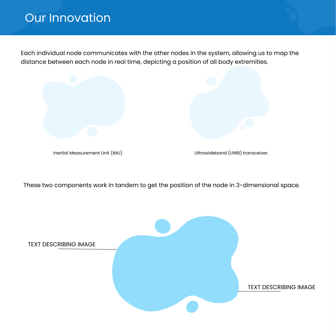
Replacing ‘How it Works” with “Our Innovation” to display Swam’s unique value proposition.
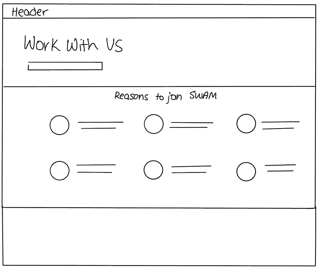
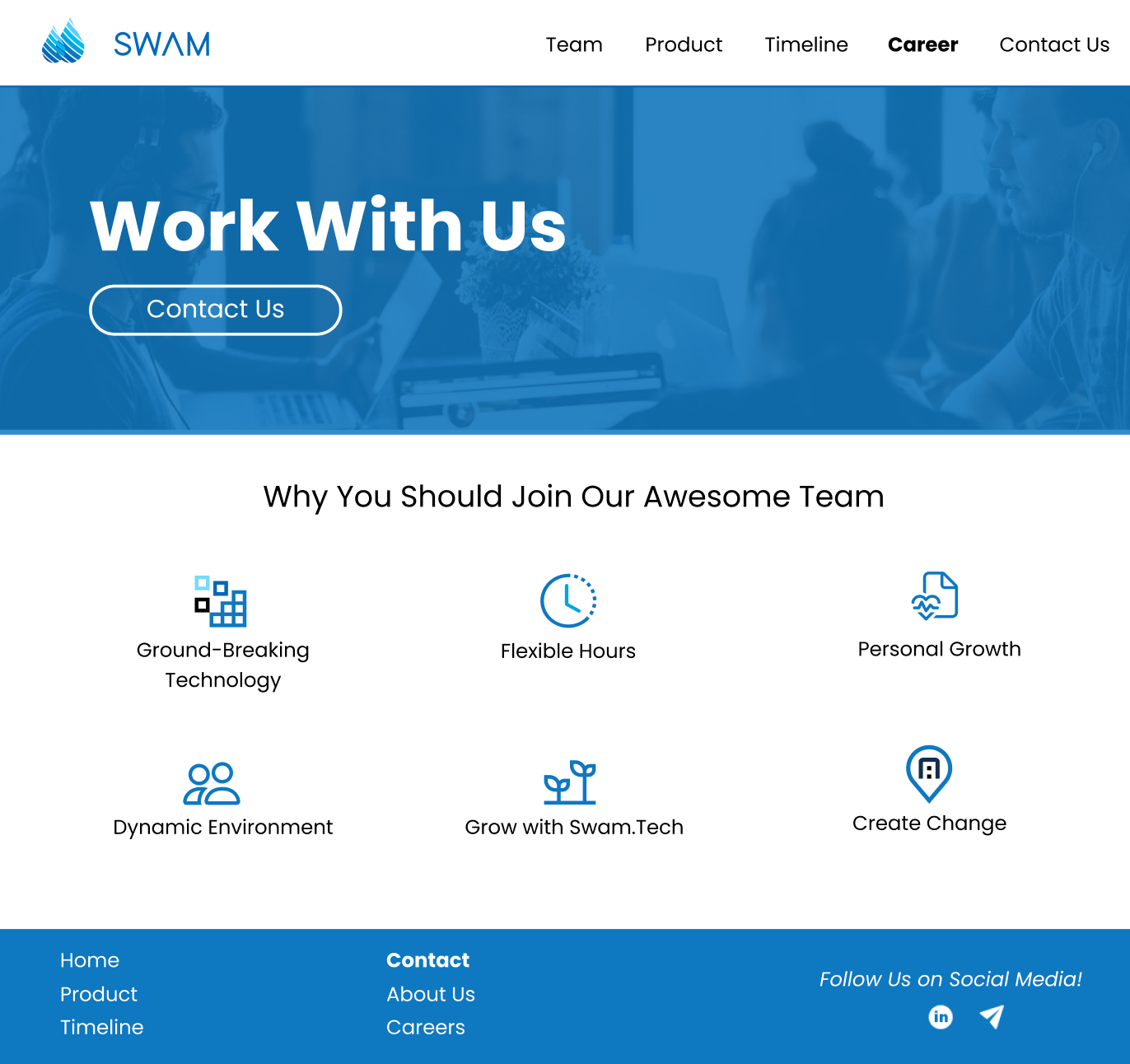
Designing a career page to attract young talent to take Swam to the next level.

FINAL DESIGNS 🏆
Developing the final website
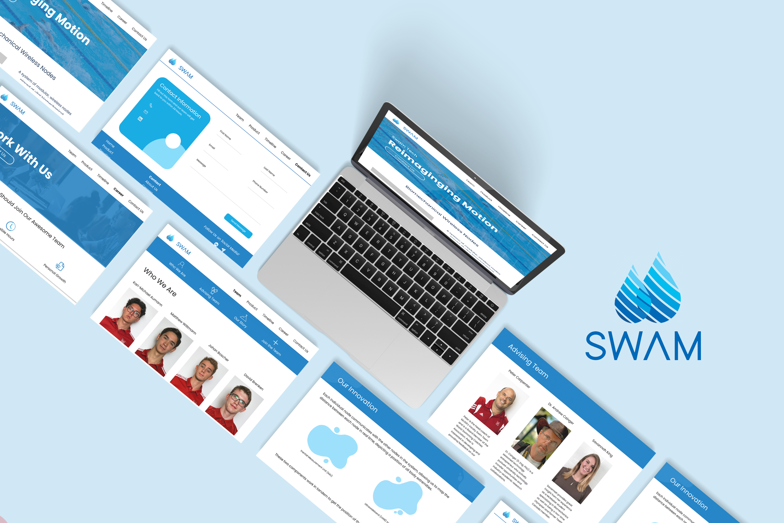
After discussing details with Swam, our team created the final website designs. The current Figma canvas includes interactive buttons, prototyping, and new branding.
BEFORE
AFTER
Full Design 💻
Swam Tech’s NEW SITE!
Key Takeaways 🔑
-
Take advantage of current resources available
You always think it’s not possible until you make a Google search. So many of my design sketches seemed impossible until I was able to take advantage of the resources readily available to me.
Some of my favourite inspiration and links are: Dribble, Zimri Mayfield Youtube Channel, and Lapa Ninja! -
Considering stakeholders every step of the way
The first people seeing the website are Venture Capitalists. As Swam is still in their very early development stages, it was essential to create strong team pages and product pages.
Learning to consider stakeholders throughout each iteration and step of the way enhanced our ideas and vision. -
Working cross functionally
As we worked with Innovative Design Co., Swam Tech, UX Laurier, and the development team, it was important to engage with each member to ensure the visions of the project aligned with everyone. These interactions clarified key insights, improved our designs, and determined additional content.
Featured on Innovative Design Co.
Check out my feature on Innovative Design Co. to view the full post!
